Often, line quality is an overlooked aspect many beginner artists don’t research much. But it is one every artist should know and practice. Applying this concept to your art can transform your drawings so much you will wish you heard about it before! So what exactly is line quality?
Line quality in drawing refers to the characteristics and attributes of lines used in an artwork. It encompasses how lines are drawn, including thickness, texture, weight, direction, and variation. Line quality is essential for conveying depth, form, and meaning in a work of art.
But you can understand this concept better if you see how it looks like on paper. Below you’ll find examples of each aspect line quality enhances on drawings.
What Is Line Quality In Art?
The line is one of the seven elements of art, and it is an essential one. Line quality is a big concept, and I’ve found most places just talk about line thickness and focus on that only, but there’s much more to it. Line quality refers to:
- Line control: If the artist intends to draw a straight line and cannot do it, practicing how to do it will enhance his line quality.
- Line force: How well an artist can control the graphite’s tone through the drawing is also an indicator of the line quality.
- Line thickness: Intentional thin and thick lines through a drawing is line quality.
- And line fluidity: Confident strokes are a reflection of drawing expertise and security. They can make your drawing look more dynamic.
Line quality is how an artist strokes lines and controls each line factor through a drawing. It means every line the artist strokes has a purpose, and it expresses something.
Let’s now see how these aspects look like on paper.
Line Control
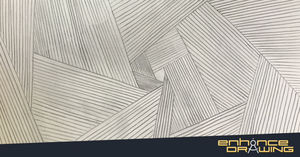
There are many types of lines, and how well you can control each of them determines your overall line quality. All straight, curved, diagonal, spiral, and zig-zag lines play a role in this. Let’s see an example of controlled, straight lines vs. uncontrolled lines.
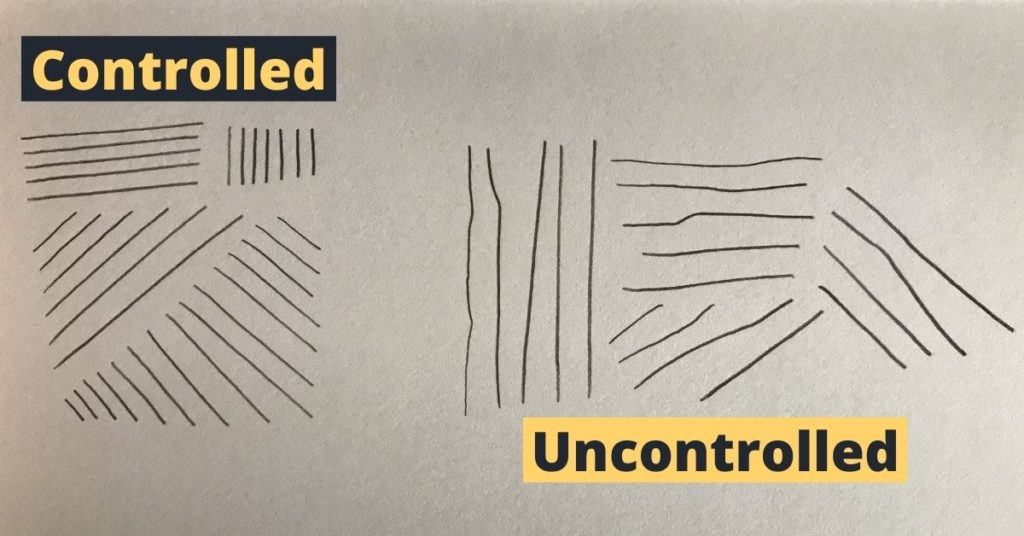
As you can see, the right lines don’t exactly look like straight lines, but the ones on the left do. Being able to control your lines is a skill that requires practice and time. In case you want to practice how to draw straight lines, visit the post I just linked! I give a lot of tips and exercises to get better at it quickly.
Line Force

Line force mainly refers to how consistent the graphite tones on your drawings are. No line should be darker than previous ones if you didn’t intend to do it. It is common for beginner artists to start drawing lightly, then get so focused that they unconsciously press the pencil too hard, making drawings look uneven.
Line Thickness

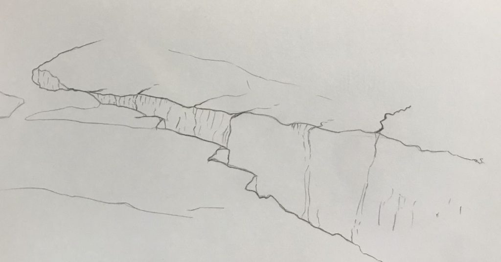
One of the most significant factors that refer to line quality is thickness. I will explain everything that thickness can modify in a drawing later in this post. But for now, all you need to know is that a drawing that plays with line thickness is a drawing that uses line quality. Below is an example of a drawing using line quality vs. a drawing without it.
Drawing WITHOUT Line Quality
Drawing WITH Line Quality
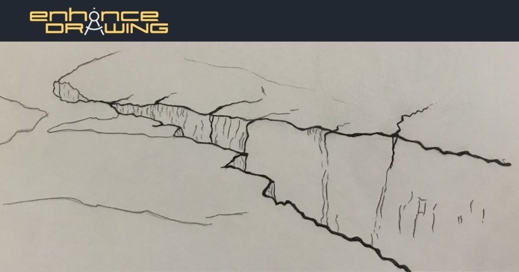
As you can see, the first drawing without line quality looks plain, while the second drawing with line quality has more depth and looks more interesting.
Line Fluidity
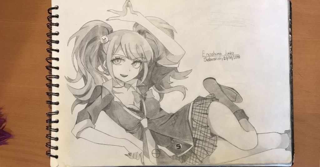
How confidently an artist draws plays a significant factor in how fluid lines look. Usually, the most intuitive way to draw a line is by searching it, and many beginner artists do it this way (which is not wrong or bad). However, this line-searching technique regularly results in a non-fluid line and makes your drawings look more static. Below are examples of line-searching and fluid lines.
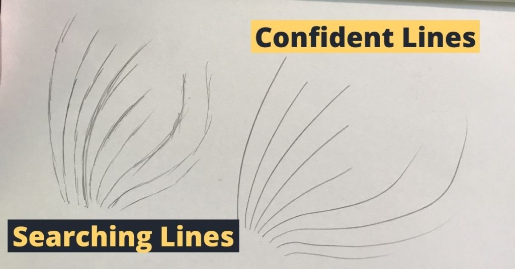
Every artist develops a unique way to stroke lines, and it can be considered one of the most significant differentiation factors between beginner artists and experienced artists. By applying all these line properties, you can make your drawings look unique and alive.
Now that we know the factors that affect line quality, you have a more comprehensive definition of what it is. To enhance this concept further, let’s take a look at how your line quality can create different illusions in a drawing and some examples of how it looks.
Line Quality Examples
As we mentioned earlier, line quality uses the line’s thickness to suggest lighting, weight, material, and more. How you draw your lines depends on the characteristic you want to indicate. The same line drawn a little bit differently can make your sketches look so different it’s astounding. Below you’ll find examples of the factors we talked about before.
Lighting (Value)
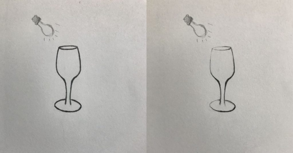
If you wish to add contrast to your drawings and indicate lighting, line quality can help you. Here, if you draw lines closer to the light source thinner and lines far from it thicker, your drawing will look more realistic.
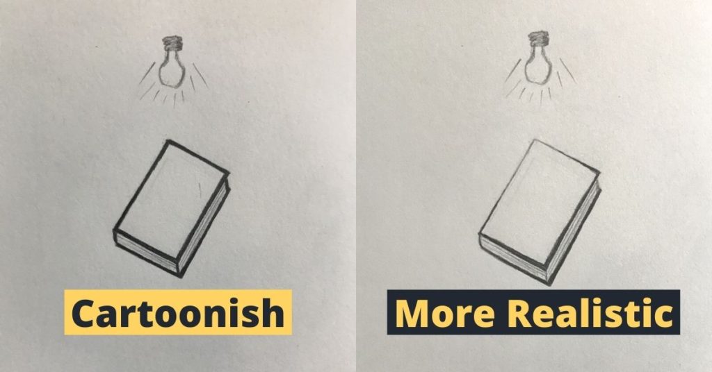
As you can see, the drawing on the left looks like a cartoon-style drawing, while the drawing on the right looks more realistic and gives you an illusion of light concentration coming from that point. If you want to go even further with this, you can cut the lines so that it looks like they vanished and reappeared again at another point, letting your brain connect them.
Let’s move onto the next line quality example.
Depth
Another way line quality can enhance your drawings is by adding depth to them. When you see things in real life, anything closer to you seems bigger than the things far from you. And that applies to lines as well. If you learn to identify the object’s perspective and the viewpoints that are closer to the viewer, you can stroke thin or thicker lines to make your illustrations more interesting. Here’s an example of how line quality can add depth to a drawing.
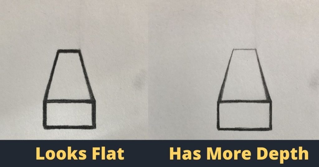
As you can see, the sketches on the left are using the same line thickness throughout the whole drawing, and they look flat even though it is clear the drawing is in perspective. On the other hand, the sketches on the right side look like they have more depth in them even though they’re using the same lines. The only thing that changes is the line quality, and that’s all it takes to make them look more real.
Texture
Another essential thing line quality brings to the table is how it allows the artist to suggest different textures. Clothing, hair, solid objects, among many other things, have incredibly different looks, so all of them should have unique, distinct lines. You can do this by changing line aspects like tone, curvature, or thickness. See the example below to see how line quality adds texture to a drawing.
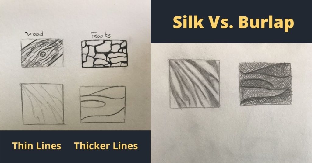
As you can see, the image on the left has thinner, lighter lines, which makes the drawing look delicate and light-weighted. In contrast, the image on the right has the opposite: thicker, darker lines. These lines create the illusion of a heavier look and make drawings seem closer.
You can always draw without thinking about line quality, but if you truly want to level up your drawing, I suggest you start applying it to your drawings.
Why Is Line Quality Important?
Line quality is potent, and artists use it to enhance their drawings in many ways. However, being an aspect of drawing we are so familiarized with, many artists in their beginner’s stages don’t know the importance of line quality; thus, they don’t apply to their drawings.
Line quality is important because we live in a three-dimensional world. Since lines on paper are in a two-dimensional format, line quality is the technique artists use to make their drawings look more real. Besides, it is one of the most crucial factors that make your drawings look unique.
To put you an example, have you ever traced a drawing and compare it to the original piece? For some reason, most traced drawings look off and plain. The reason why this happens is that there’s a lack of line quality. The original piece probably has different line thicknesses, shades, and other factors that affect its looks. However, the nature of tracing prevents the illustration of these qualities in a line. You’re most of the time outlining the drawing without a purpose, and the result will most likely be a steady, uniform line throughout the whole drawing. And although this is not necessarily bad, not adding line quality to your drawings will hold you back in many instances.
If you want to improve your overall line quality and level your drawing skills, see how to improve it below!
How To Improve Your Line Quality
It is common for many artists to wonder why their drawings lack texture, realism, weight, or something important, even though they have a good structure, shape, and proportions. Usually, the answer to this is: you’re not making good use of line quality.
But we can fix this by improving our line quality. To do it, we need to practice these four main factors: control, force (tone), thickness, and fluidity. Let’s start by identifying your skill level.
All technique exercises will be below the recommendations.
If you’re new to drawing or have phew experience doing it, start by testing your skills.
- For control, draw different types of lines: horizontal, vertical, curved, spiral lines, and more. How well you draw each line will help you identify what you need to improve.
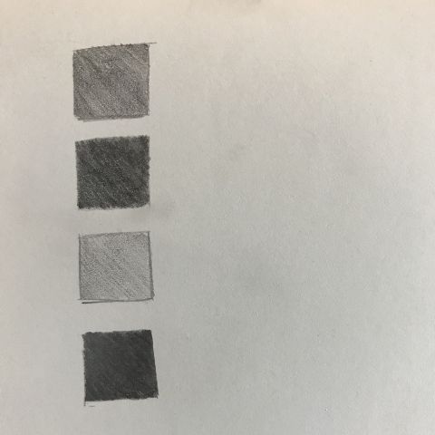
- For force(tone), draw squares and fill them with an even graphite tone. Try to get different shades using only one pencil. If no matter where you look at the square, you always see the same tone, then you have good force control.
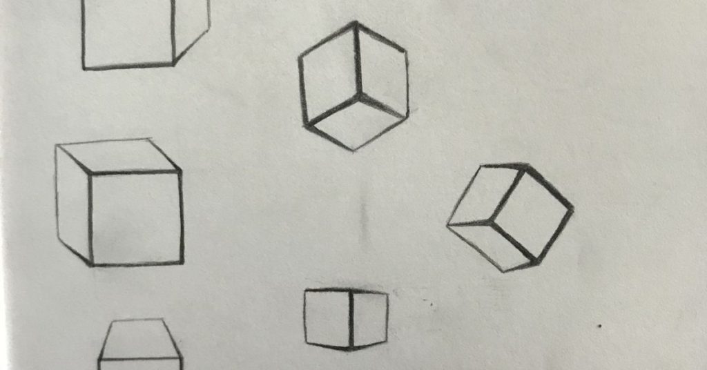
- For thickness, draw three-dimensional shapes like squares, triangles, and other figures or combinations. Bear in mind what we saw above when talking about depth. The goal here is to make the lines closer to you thicker and the lines far from you thinner.
- For fluidity, just as we did for control, draw lines in different ways, except this time, we won’t be as careful. The goal here is to make your lines seem confident and unique. Line fluidity is the most challenging skill to get, mainly because a lot of time and practice is crucial to get good at it.
If you have experience drawing, you will most probably know what you need to improve. Take a look at your drawings and identify what’s missing or what you can do better. To give you some ideas of what to look at in your drawings, focus on these aspects of it:
- Do all the outline lines have the same thickness? If yes, then this can be an excellent opportunity for improvement. Add more thickness variety to your lines.
- Do all the outline lines have the same tone? If they do, bear in mind that tone variety can make your drawings look more real. If your lines don’t have the same tone overall, see if the tone you gave them makes sense to where they are.
- Do you feel your lines have the straightness or curvature you wanted them to have? See how you drew each line individually and analyze if it looks like it has the right shape. You would be focusing on the macro details rather than the big picture, so it will be easier to find weird line transitions or connections.
If you already have a good line quality, you need to learn from the artists you admire. See their sketches and drawings and analyze why you like them so much. For me, I would see sketches of Jeff Watts and try to mimic his lines. He is an artist I consider one of the greatest nowadays. His line quality is so exceptional even his sketches look like masterpieces.
Now that we have all the recommendations ready let’s look at some exercises that will improve your line quality.
Line Quality Technique Exercises
Although our focus here is to get better at drawing lines, be sure you’re using the right posture and technique while you do it. For example, it is much easier to draw precise lines using your elbow and shoulders than using your fingers and wrist.
Line Quality Exercise 1 – Draw Better Lines
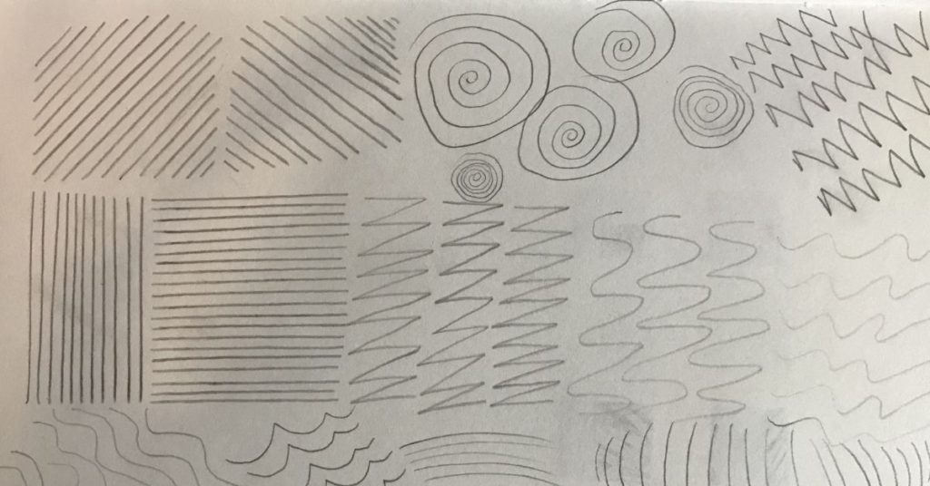
If the lines don’t look the way you intended to, you need to repeat this exercise for 10-15 minutes daily until you get the desired result. I would say you can see great results in a month by only doing this. The goal here is to identify what line you want to draw better, and draw that line repeatedly.
Line Quality Exercise 2 – Force Control
I used a 2B pencil for this exercise. To do it, follow the steps below:
1- Draw a column of four squares and fill them with different graphite tones.
2- Draw another column of four squares next to it and try to get the same tones again.
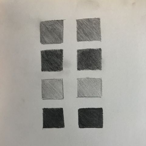
3- Do this daily for 10-15 minutes until you get the desired result.
Line Quality Exercise 3 – Line Thickness
As we saw above when we talked about depth, the goal here is to make our drawings feel more three-dimensional. Draw three-dimensional figures like shown below and make sure the lines that are far from the viewer are thinner and lighter, whereas the ones closer to the viewer are darker and thicker.
Line Quality Exercise 4 – Line Fluidity
Line fluidity is a complex skill, and it will level up your drawing once you master it. It refers to how fast you can draw smooth, accurate lines with different forces. I’ve found the best way to practice line fluidity is to focus on one at a time. To start, draw “s” like lines repeatedly, 10-15 minutes a day until you get consistent with it, like as with a signature. Then, draw horizontal lines and repeat the process, and so on.
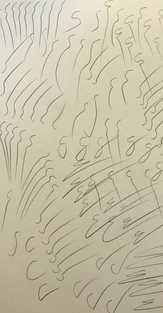
I recommend you to start with “s” like lines because they are the most common lines you’ll find when drawing overall.
And that’s it for line quality! Definitely a drawing aspect every artist should consider to level up her skills. I hope you guys have a great time practicing it and studying it.
Happy drawing!
